Sonja Neef, a lecturer in European media and culture at the Bauhaus University in Weimar, devotes her study ‘Imprint and Trace’ to the topic of ‘Handwriting in the Age of its Technical Reproduction’. In much the same way that Walter Benjamin, to whom the subtitle obviously alludes, did not object to photography as such, but only to the photographic reproduction of original works of art, so Sonja Neef does not lament the disappearance of handwriting. Whether the practice of handwriting will indeed ever disappear completely is, of course, an open question. If today’s continued presence of, say, vinyl albums – hastily written off as outmoded by many a commentator only a few years ago – is anything to go by, then there would seem to be little reason to be pessimistic about the future of handwriting. (After all, he who writes by hand may be said to demonstrate character, in that he writes against the tide of the zeitgeist.) On the contrary, what Neef sets out to show is that our current standardised typographies and digital substitute worlds remain indebted to handwriting as their ancestral predecessor. Cultural techniques may be everchanging, but they remain latently ever-present. Even the latest flat-screen technology is not left untouched by the history of handwriting. Neef makes it clear that traces of handwriting are to be found everywhere. What is important is ‘to contemplate the Manual within the Digital: the fingerprint on the touchscreen, the stylus on the writing pad of a tablet PC; in short, to consider handwriting from [the perspective of the] screen’ (p. 29).
Source: Wikimedia Commons
Neef’s observations are informed by the conceptual vocabulary of such figures as Jacques Derrida and Friedrich Kittler, and consequently the study as a whole accentuates the cultural-philosophical more than media-theoretic aspects. To be sure, dogmatic adherence to any particular methodology – what Paul Feyerabend used to call ‘Methodenzwang’ – is not something one accuse the author of. What one might wish to criticise is the overambitious scope of the historical trajectory, which the author sets out to chart: Neef’s observations concerning the development, the significance, and the destiny of the technique(s) of handwriting go all the way back to the evolutionary origins of hand-like extremities “from fish to homo sapiens”, and span the whole breadth of cultural evolution, from human prehistory to the ancient world, the medieval period, the modern age and digital postmodernity. Thus, the author takes her readers on a tour de force from hieroglyphics to screen-savers, from cuneiforms to corrective fluid.
Neef, however, sees no difficulty in going back in history – or, for that matter, in extrapolating into the future. Her goal is to subvert the seemingly clear-cut distinction between the techniques of handwriting and the printing press: ‘My thesis is that there is no final dichotomy […] between, on the one hand, printing as a mechanical, technical, or digital way of writing and, on the other hand, handwriting as an individual, unique, and singular trace; instead, the two principles of “imprint” and “trace” are always already intertwined, both historically as well as systematically’ (p. 25). In other words, whatever the future may bring, handwriting survives safe and sound.
The individual chapters of the book span a wide range of topics and are refreshingly brief; in general, Neef writes succinctly and avoids long-winded sentences. As a result, her writing tends to be more intelligible than that of her theoretical role models. Nevertheless, it seems that writing in an accessible manner continues to be a professional risk within German-language academia. At the level of terminology, Neef pays heed to the expectations of her academic peers: The average reader will likely need a dictionary in order to make sense of such learned chapter headings and phrases as ‘Manus ex machina’, ‘Exergum’, ‘Dactylography’, ‘Currere’, ‘Ceci tuera cela’, ‘Infra-mince’, and the good old ‘Paralipomena’ (especially given that classics scholars are presumably not the main target group of the book).
Texts in the humanities, especially when they are (as in this case) reworked versions of an earlier PhD or Habilitation thesis, are often meant to demonstrate the author’s originality and independence. However, there is such a thing as too much originality – as Walter Benjamin found out the hard way when his Habilitation was at first rejected by the University of Frankfurt. Perhaps in order to avoid such a painful experience, Neef also dutifully goes over much secondary material. What emerges from this is a thoughtful and plausible assortment of important thinkers (Heidegger, Derrida, various anthropologists), who pondered the significance of hands and hand-writing. In outlining their views, Neef often develops her own theoretical positions, forges new connections, and delineates her argument from the views of others. As a result, the reader is spared the déja-vu experience of thinking that somewhere, somehow, one has read all this before.
Neef’s intellectual tour de force from antiquity to the present comes to a stop already half-way through the book. The remaining chapters are for the most part revised versions of previously published papers on such varied topics as graffiti, Anne Frank’s diary, and tattooing. While these chapters are nicely illustrated with photos and graphic images, thus inviting the reader to browse among them, they do not, as a whole, fit very well with the first half of the book. Towards the end, the book reads more like a collection of essays. All in all, however, Neef’s book not only conveys valuable insights into the cultural-philosophical significance of the ‘old’ medium of handwriting, but also whets the reader’s appetite to dig out that old fountain pen again – irrespective of whether one intends to draw precise block letters on a page or indulge in the magnificent swirls of ornate calligraphy.
Sonja Neef: Abdruck und Spur. Handschrift im Zeitalter ihrer technischen Reproduzierbarkeit Kulturverlag Kadmos, Berlin 2008 ISBN-13: 978-3865990372 Softcover, 360 pages, EUR 24.90
Frank Berzbach teaches psychology and social sciences at the Ecosign Academy of Design, Cologne University of Applied Sciences (FH Köln).
It has been some time since the phenomenon of rave disappeared from the perception of the general public. Nowadays, when one speaks of the ‘techno movement’, one typically does so in the past tense. The images of Berlin’s ‘Love Parade’ are but faint memories, documenting how a carnivalesque subculture has been absorbed by the mainstream of a ‘fun-driven society’ (Spaßgesellschaft). That great musical current of the 1990s, it seems, has turned into a mere trickle.
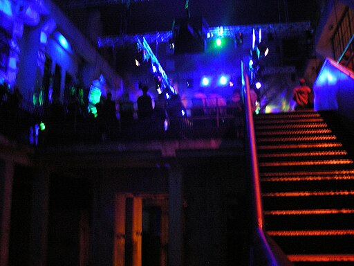
View of the Berghain (Photo: Bart van Poll, used under cc-by-sa-2.0 Wikimedia Creative Commons licence.)
Tobias Rapp, in his book Lost and Sound, objects to this scenario of decline and attempts to show that, despite its reduced ‘surface visibility’, the culture of techno music in Berlin is alive and well. After the end of the hype, about ten years ago, the techno scene – this is one of Rapp’s central theses – withdrew from everyday culture and went underground, where it went through a period of renewal. One might think that Rapp is dealing with a niche phenomenon, which would be at best of local interest. But the author – who recently moved from being editor of pop culture at the Berlin daily Tageszeitung to a position at news-weekly Der Spiegel – argues convincingly that the clubs of Germany’s capital have shaped how German culture as a whole is perceived at an international level.
Tobias Rapp combines subjective first-person reports from Berlin’s nightlife with other passages that are written in a sober, more analytic mode. At both levels, he describes the astonishing attraction that Berlin has been exerting on DJs, producers, and weekend ‘Easyjet ravers’. Rapp estimates the number of techno tourists, who arrive each weekend on budget flights headed for one of Berlin’s airports, to be (‘not implausibly’) around 10,000. As a main cause for this boom, Rapp identifies not only the emergence of budget air travel, but also the oversupply of real estate in the German capital. Thanks to low commercial rents, a relatively egalitarian clubbing scene has emerged, which – ‘unlike in other major cities’ – does not target the celebrity and luxury segment of the market.
One can read Rapp’s study from different perspectives. As a book about Berlin, it may not provide touristic advice on the city’s hottest night spots, but it provides a well-researched survey of the clubs along the river Spree. To be sure, the author sometimes writes with the passion of a true aficionado, but for the most part he manages to keep a professional distance between him and his topic. Nonetheless, he hardly hides his satisfaction when he recounts, for example, the observation of a female club-goer, who describes ‘Techno in Berlin’ as ‘just like Reggae in Kingston’.
Rapp did not intend to write a music book that would describe the evolution of house, techno, and related genres of electronic music (although his recommendations of recordings, given in the appendix to the book, provide an excellent starting point). Rather, his interest is more in cultural-sociological findings: such as the ‘commune model’ that is being practiced at ‘Bar 25’ (‘Hippie de luxe’), or the only partial visibility of the clubs. Thus, at the ‘Berghain’, the leading club in its segment, a strict ‘no photos’ policy is in place, which not only gives the place an aura of exclusivity but also allows for an element of egalitarianism: what counts is ‘the celebration of a collective subject without celebrities’.
That Rapp’s concern is with general conclusions, not merely with Berlin-specific observations, is especially noticeable in his discussion of online communities. He describes in detail how ‘an authentic local subculture … becomes the topic of discussion in global networks’. This provides a good insight into the structure of a wider public of pop culture, which constitutes itself via the internet with its global reach. For example, in a relevant internet discussion group, Rapp encounters one 17-year old from Toronto who has never been to Europe, but knows everything about the current preferences of the DJs at ‘Berghain’, the place of his longing. One of the interesting aspects of the book is how it makes tangible – via the example of Berlin’s club culture – the much discussed notion of ‘glocalisation’.
Lost and Sound is not a political book in the narrow sense. However, Rapp’s reference to the asymmetrical perception of techno culture – ‘hardly any in Germany, a lot of attention abroad’ – is nonetheless relevant to cultural policy-makers. With respect to the role of local politics and economic development, Rapp argues that the current boom of medium-sized clubs and venues was only possible against the backdrop of the failure of wholesale urban redevelopment policies in the 1990s. In a detailed and sophisticated manner, he describes how popular criticism led to a referendum against the large-scale redevelopment plans that had been drawn up for the bank of the river Spree. The fact that the controversy about the MediaSpree plans culminated in the slogan ‘place for clubbing or location for investors?’ may well be due to the specific conditions in Berlin. However, looking beyond the political sensitivities within the German capital, this case study may well contain general insights into the relation between, on the one hand, alternative culture with its hedonistic outlook and, on the other hand, institutionalised politics.
Not least from a creative industries perspective, the book is a worthwhile addition to the literature. Rapp describes the change in significance of record labels, which, in times of a crisis-like decline in record sales, have become an integral part of strategies of self-marketing, by DJs who team up with producers (and vice versa). He also explains how it is that certain record shop are able to maintain their economic and cultural function, even in times of crisis, because they cater to a specialised audience. Part of Rapp’s study is also concerned with the interdependence between club culture, fashion, tourism, and technology: for example, DJ software from Berlin is now being exported to the U.S. for use during church services.
Regarding the clubs themselves, the author arrives at an upbeat conclusion: ‘With a bit of good will and some idealization one could say: the house and techno scene in Berlin has retained the good aspects of independent culture – economic independence, artistic integrity, and an unwillingness to compromise – while simply having done away with the bad aspects: simplistic anti-capitalism, glorification of self-exploitation, and lack of professionalism.’ In times of a global economic crisis, that is not a bad result.
Tobias Rapp: Lost and Sound. Berlin, Techno und der Easyjetset. Suhrkamp, Frankfurt 2009. ISBN-13: 9783518460443 Softcover, 268 pages, EUR 8.50
Norbert Niclauss works on music and cultural policy at the German Federal Government’s Commission for Culture and the Media (BKM), Berlin.
The German version of this article first appeared in Berliner Republik, No. 2/2009; translated and reproduced with permission. Translation: The Berlin Review of Books.
“It is the master who establishes the rules and not the pupil, and the master is permitted to break the rules, even his own.
— Jan Tschichold to Dorothy Sayers.
No discussion will take place.
— from a poster announcing a Tschichold lecture on ‘the New Typography’.
Jan Tschichold is always described as a pioneer of typographic and design modernism. But if he were invariably described as the prodigal son of classical typography and design—that would be true, too. You could say he had two careers, crowned by achievements that are almost mutually antagonistic, in design sensibility. But there is an aesthetic continuity through it all, a cool, temperamental steadiness. This is interesting not just for what it says about Tschichold but about the limits of labels like ‘modernism’ and ‘classicism’.
One sympathizes with Dorothy Sayers, who didn’t like the asterisks on the title page of her book, and had the temerity to point out to the designer that they were in violation of the designer’s own stated rules concerning the placement of such things. Even if one agrees the asterisks look fine, one might reasonably inquire as to what are the real rules, if everything spoken is only made to be broken.
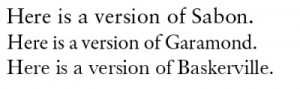
Which brings us to a new book: Jan Tschichold, Master Typographer (Thames & Hudson, 2008). If we want to judge this master by a life of works, this book is a solid success. We have here a generous and representatively broad sample, judiciously selected and handsomely presented. There are many examples of Tschichold’s ‘new typography’ from the 20’s. The posters—particularly the film posters—are perhaps the most broadly appealing expressions of Tschichold’s modernist dreams, all sans serif, asymmetric boldness and strong color. These early works are what Tschichold’s modernist manifestos never manage to be: true prophecies. (We’ll return to this point.) Master Typographer also showcases book cover designs from all periods of Tschichold’s career. Here the great achievements, in both quality and quantity, are late. Tschichold took the design helm at Penguin between 1947 and 1949. During this brief tenure, he designed and oversaw production of 500 titles (consider what that means, as a daily rate.) Master Typographer also contains numerous type and calligraphic specimens, from early to late. Most welcome are the complete presentations of various modernist faces which, unlike Tschichold’s late, classical masterpiece, Sabon—are not so easy to see today.
But if we want to judge Tschichold by his works and words; or rather, since he was a worker with words, if we want to judge him by what he worked in the medium of other people’s words and by what he meant by his own; if we want to see the unity, solve the puzzle of Tschichold’s apparent departures and reversals of his own line; then, I think, we may find this new book just a bit lacking in discussion at one crucial point.
There might have been something Tschicholdian about that, too. But I think it was a minor breakdown in planning – a thoroughly un-Tschicholdian thing. Master Typographer contains an introduction and four solid essays, by different authors. There is some overlap and not as much synthesis as might have been achieved. One particular quote—an important one, no doubt—is repeated in no less than four places in the book (in the timeline of Tschichold’s career, then on pages 21, 64, 302). But, as the quote (reproduced below) reflects on the overall arc of Tschichold’s career, and as the introduction is relatively short, and the essays more piecemeal in their respective attentions, none of the contributors makes it his or her business to achieve a full synoptic view. What does this quote really mean?
But first, some basics, for the benefit of readers not so familiar with this master. Tschichold (born in Leipzig in 1902) was a child prodigy where letters were concerned. ‘Prodigy’ means wonderful sign. Johannes—later he changed his name to Ivan (1923), then Jan (1926)—was a wonderful sign of wonderful signs to come. He was the son of a lettering artist and sign painter and, by the tender age of twelve, was an earnest, enamored and—what is more remarkable—precociously historicist student of letterforms. The 1914 International Exhibition of Graphic Arts, and his native Leipzig’s Hall of Culture exposed him to the breadth and depths of the European book arts. As a teen he studied calligraphy, etching, engraving and bookbinding. It is worth emphasizing that Tschichold was, at all stages of his career, the purist lover of Form who kept a firm hold on the material basis: practical production methods. He may have been (even into his humane and tolerant old age) ever the dogmatically opinionated dweller in a Platonic Book Heaven of his own devising. But he never took an impractical step when it came to making an actual book.
Perhaps only a man who had deeply studied 16th Century writing masters before the age of 16 could be so thoroughly of the early 20th Century as to declare, by the time he was in his 20’s, that there is—and must be—a fundamental, henceforth un-bridgeable gap between ‘the old typography (1440-1914)’ and the New. From Tschichold’s The New Typography (1928):
None of the typefaces to whose basic form some kind of ornament has been added (serifs in Roman type, lozenge shapes and curlicues in Fraktur) meet our requirements for clarity and purity. Among all the types that are available, the so-called “Grotesque” (sanserif) or “block letter” (skeleton letters would be a better name) is the only one in spiritual accordance with our time.
To proclaim sanserif as the typeface of our time is not a question of being fashionable, it really does express the same tendencies to be seen in our architecture. It will not be long before not only the “art” typefaces, as they are sometimes called today, but also the classical typefaces, disappear, as completely as the contorted furniture of the eighties.
Skipping ahead, rapidly, through several stages of Tschichold’s career—most dramatically, arrest and brief ‘protective custody’ detention by the Nazis on charges of un-German typography and ‘cultural bolshevism’, followed by emigration to Switzerland, where Tschichold spent most of the rest of his life—we eventually come to our four-times repeated quote, from 1959:
In the light of my present knowledge, it was a juvenile opinion to consider the sans serif as the most suitable or even the most contemporary typeface. A typeface has first to be legible, nay, readable, and a sans serif is certainly not the most legible typeface when set in quantity, let alone readable … Good typography has to be perfectly legible and, as such, the result of intelligent planning … The classical typefaces such as Garamond, Janson, Baskerville, and Bell are undoubtedly the most legible. In time, typographical matters, in my eyes, took on a very different aspect, and to my astonishment I detected most shocking parallels between the teachings of Die neue Typographie and National Socialism and fascism. Obvious similarities consist in the ruthless restriction of typefaces, a parallel to Goebbel’s infamous Gleichschaltung (enforced political conformity) and the more or less militaristic arrangement of lines.
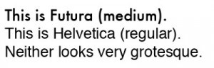
For the benefit of the typographically un- or semi-initiated: serifs are the horizontal sharp bits on Roman letterforms.
Fig. 1: Serif typefaces.
Sans serif (a.k.a. grotesque) faces (fonts) lack the pointy bits. Here are two famous and popular sans serifs.
Fig. 2: Sans serif typefaces
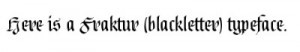
Finally, Fraktur (a.k.a. blackletter, or broken, or gothic type) designates a range of faces that seem distinctively Germanic (the Gutenberg Bible was set in Fraktur); but which can also seem, and are sometimes called, ‘Olde English’.
It is obvious that a typographer must be professionally preoccupied with the shapes of letters. But it can seem ridiculous to take, say, the serif/sans serif divide so seriously. Tschichold’s early statements are almost comic in their ‘Typocalypse Now’ absolutism, their evident sense of bestriding an historic chasm, when surely it is just a question of filing down the little bits (or not), is it not?
Fig. 3: Example of a Fraktur typeface
It helps to know that in Germany in this period (up until the end of World War II) most printed matter was set in some form of Fraktur, in contrast to the rest of Europe, where Roman letterforms have long dominated. Perhaps predictably, the result was intense attachment, elective affinities for particular letterforms, and occasional eruptions of us-vs.-them Kulturkampf: romanticism vs. classicism; (French) civilization vs. (German) culture. (What hand will children first be taught to write in school? This becomes a vital question.) Bismarck declared he would not read a German book set in Roman type. The aphorist Georg Lichtenberg said that he felt such books had been translated. The Nazis mandated Fraktur; then, in 1941, in a dramatic typeface about-face, outlawed it as ‘Jewish’. But situating Tschichold in this cultural context, while it may make some sense of his early proclamations, hardly makes them sound sensible.
Tschichold’s 1959 statement of the reasons for his shift away from the new typography (a statement he might have made already in the 30’s: his change of mind did not occur in 1950’s) seems humane and moderate. Yet it is still in danger of tipping over into equal and opposite extremism. Should shop talk about type be so lightly projected outwards—onto the world of politics? One is tempted to show the absurdity by standing the argument on its head: we would hardly try to prove that fascism was only an aesthetic sensibility by comparing it to the new typography. (‘I was just a graphic designer,’ would hardly have served defendants at Nuremberg, unless the point was to make ‘I was just following orders’ sound convincing by comparison.) Why, then, make the new typography sinister by associating with fascism? Even if we grant, for the sake of argument, that there might be a common denominator at the level of Wille zu Stil [will to style], as Tschichold terms it—some purist drive to eliminate and reduce—surely the fact that this can manifest itself evilly or innocently goes to show the drive itself is neither. (If we cannot tell the difference between fascism and a certain degree of fussiness or minimalist fastidiousness—what difference can we tell?)
To be fair, this is Tschichold’s precise point in 1959: not that modernism was evil but that it wasn’t necessarily good, hence not necessarily necessary. He concluded, in the end, that serifs are not the functionless ornaments he had taken them to be. They are graceful indications of line, efficiently ushering the reading eye on its way down the hall of words. His asymmetric juxtapositions of word and image—all the possibilities opened by New Typography—seemed to him, looking back, not so much a dead-end, let alone a disaster, as a confined, local district. The new typography is fine for a certain class of advertising product: posters, very notably. It is not so suitable for other, more traditional print products: most classic books. Sans serif faces work for eye-catching and eye-aiding display: public signage, anything that must be taken in at a glance, at a distance, on the move. Serifs suit eye-leading reading.
It sounds sensible and moderate, to the point where one wonders whether the expense acknowledged in the following passage from a late Tschichold essay was really necessary:
Fifty years of experimentation with many novel, unusual scripts have yielded the insight that the best typefaces are either the classical fonts themselves (provided the punches or patterns have survived), or recuttings of these, or new typefaces not drastically different from the classical pattern. This is a late and expensive, yet still valuable, lesson.
It makes a good story. The precocious student of classical letterforms, who prematurely consigned all that to the dustbin of history, crowned his career with classic book designs, and a classical typeface named after Sabon, a contemporary and follower of the great Garamond. (Sabon inherited and preserved a portion of Garamond’s type collection upon the master’s death.) To quote T.S. Eliot:
We shall not cease from exploration And the end of all our exploring Will be to arrive where we started And know the place for the first time.
Nice travel tale or not: was Tschichold’s journey really necessary? Grant that it was necessary personally, for him—due to peculiar personal situation and idiosyncratic temperament—was it impersonally necessary? (The logic of good typography should always be impersonal: Tschichold says so, early and late.)
Why is ‘Master Typographer’ a good title for a book about Tschichold, when it might be objected that he was not just a typographer, but a book designer and graphic artist as well? Typography is the art of arranging shapes into letters, also the art of arranging letters into shapes. Graphic design is a matter of arranging two-dimensional shapes—some of which are typically letters—into two-dimensional shapes, and book design is a part of that. Tschichold’s contribution was to be a unifier of this field and, at the same time, a distinguisher of it from others. He was one of the first to conceive of graphic designer, particularly where books are concerned, as an autonomous and distinctive field of artistic achievement. Or rather, he was one of the first to make it a reality, by combining vision with will and sufficient practical know-how. His lifelong, formalistic obsession with rules and grids and abstract geometry allowed him to separate the profession of graphic designer from the crafts of production editor, compositor, printer, so forth, giving the former complete control over the latter. (The tale of how Tschichold achieved this at Penguin, by combining four pages of rules with sheer force of personality, is a fascinating one. Richard Doubleday’s essay in the present volume tells the tale.) The common denominator of the new typography and Tschichold’s later, thoroughly classical Penguin work, is fine engineering—a talent for consistent production; something that is neither here nor there, with regard to the ideological lines between modernism and classicism.
We could say that Tschichold’s true competitor was never classicism, while he was a modernist – or modernism, in his late classical phase. The alternative was always ‘Arts and Crafts’-style ‘boutique’ book artistry: William Morris and his Kelmscott Press, very notably. There obviously was a pre-modern period when the ‘book artist’ could enjoy the complete control that industrial methods portioned out along a production line. Hand-copyists and illuminators did it with their own hands. The argument between Tschichold and the likes of William Morris comes down to the question of whether the need to re-establish artistic control necessitates rejection of these modern, industrial methods, or instead their technically-knowing adaptation. Can you break the machines to the yoke of art? Tschichold always took the ‘modernist’ line against the ‘medievalist’ (I would call it) alterative, in this argument. Tschichold was proudest of how, at Penguin, he brought into the world a million well-designed, relatively inexpensive books. That industrial achievement was the trump over cottage ‘book artistry’. (Morris’s Kelmscott Press made handsome books, no question. But they were expensive, exclusive items.)
We can make a related point by considering modernist typography as an inherent paradox. Let us start by noting Tschichold’s (and other modernists’) penchant for rules that aren’t, because they can be broken. How are faux-rules—that is, apparently load-bearing elements that can in fact be omitted, without the roof coming down—different from the faux-classical Greek pillars-as-facades, or mock-Tudor fake beams that are the targets of modernist purism? If it is hideous to perpetrate false-front deceptions in architecture, how not in philosophy of typography? But then all modernist manifestos are hideous, betraying their own ‘form follows function’ spirit with every strictly false, sweeping declaration on behalf of the New.
The trouble goes deeper, where typography concerned. Fashion in type is sometimes analogized to fashion in clothing (a typeface is a suit of clothes for the alphabet); or, more frequently, to architecture. But there is a problem with the former comparison: namely, there is no such thing as ‘naked’ letters ‘in themselves’. This shows up a limitation with the architectural analogy (generally sound though it is). What is the ‘function’ of a letter—of an A, say? Its function is, simply, to look clearly like an A. That is, its function is to imitate, appreciatively, earlier forms that looked like A’s. But if ‘function must follow form’ is the solution to the riddle of how form can follow function, this is a paradox that challenges the coherence of the modernist philosophy.
This is not to say that letter shapes cannot be objectively well-suited to (or ill-suited to) materials or media—stone and chisel, pen and paper, moveable type, software and display. Still, given that the function of an A is to look like an A, there can be no ahistorical reading off of a formal solution to the problem of what ‘functions best’, from the underlying material conditions. This is, in a sense, the burden of at least one late Tschichold essay, “The Importance of Tradition”. It is an insight well illustrated by the diversely successful design products on display in Master Typographer.
In The New Typography, before he sees this, Tschichold discusses the ‘problem’ of ugly proliferation of typefaces as if it were analogous to the problem facing an engineer tasked with getting a train from one end of Europe to the other, before there has been any standardization of track gauges. Such a problem no doubt calls for a simple, uniform, even authoritarian (if you want to put it that way) reduction of the ugly many to the functionally optimal one: an engineering standard. But a reading eye, thrown by a shift from Roman to Fraktur, or from serif to sans serif, is not nearly enough like a train unable to run on a different track gauge to warrant the conclusion that modern typography is an engineering problem like the track problem.
An ‘A’ does not aspire to be (if only we scraped off the ornament) a pure geometrical form. If you design a font with an elegantly minimal triangle A—that’s nice. But it is not ‘truer’ to the nature of A than some ornamental alternative. The puzzle of how to instruct and enable compositors, printers, so forth, to do exactly what is wanted, consistently, is not the same as the question of how to make a really elegantly exact and consistent set of letterforms, or book pages. Tschichold wanted both—and always got them. Still, the problems are quite distinct.
One final thought about Tschichold’s legacy: in time he came to see his youthful modernist enthusiasm as—not so much a mistake, but a blinkered insight about design solutions in an industrial, engineering age. He took the exception—a narrow set of design challenges—for the rule. But, in an odd way, in an internet age, with easy access to Photoshop and all sorts of sophisticated word processing and design software, the exception has become the rule. Perhaps we should now say Tschichold’s limited, modernist truth was a premature post-modern truth (post-something; post-Gutenberg, perhaps). What his modernist associate László Moholy-Nagy called ‘typofoto’—the aesthetically distinctive synthesis of image and type—is now the norm, for better or worse. Mixed words and images are the design default, from which pure text and pure image are the departures. Architecturally speaking, a classic book poses a most worthy, yet non-paradigmatic design problem: namely, how to design a handsome door, leading into a very long hallway, down which one walks until one comes to the exit. (A novel, for example.) One would hardly make the solution to the problem of how to design a hallway the template for evolving solutions to every other sort of problem in architecture.
Tschichold’s modernism becomes ever more irrelevant and fantastic-sounding, insofar as it consists of statements of alleged engineering necessity. I have a thousand fonts on my computer; there is not much point pretending this is much of a technical drag on my system. But Tschichold is ever more relevant, the more fonts I collect, the more Photoshop effects I can generate, as a teacher of ‘tact’ (as he called it), as a master maker of things of beauty worthy of study and admiration.
Cees W. de Jong (ed.): Jan Tschichold — Master Typographer. His Life, Work, and Legacy Thames and Hudson: New York 2008 ISBN 13: 978-0500513989 Hardcover, 384 pages, 350 illustrations (150 in colour), US$ 75.00
John Holbo is an Associate Professor at the National University of Singapore. He is also a regular contributor to cultural-political blog Crooked Timber.
We use cookies on our website to give you the most relevant experience by remembering your preferences and repeat visits. By clicking “Accept All”, you consent to the use of ALL the cookies. However, you may visit "Cookie Settings" to provide a controlled consent.
This website uses cookies to improve your experience while you navigate through the website. Out of these, the cookies that are categorized as necessary are stored on your browser as they are essential for the working of basic functionalities of the website. We also use third-party cookies that help us analyze and understand how you use this website. These cookies will be stored in your browser only with your consent. You also have the option to opt-out of these cookies. But opting out of some of these cookies may affect your browsing experience.
Necessary cookies are absolutely essential for the website to function properly. These cookies ensure basic functionalities and security features of the website, anonymously.
Cookie
Duration
Description
cookielawinfo-checkbox-analytics
11 months
This cookie is set by GDPR Cookie Consent plugin. The cookie is used to store the user consent for the cookies in the category "Analytics".
cookielawinfo-checkbox-functional
11 months
The cookie is set by GDPR cookie consent to record the user consent for the cookies in the category "Functional".
cookielawinfo-checkbox-necessary
11 months
This cookie is set by GDPR Cookie Consent plugin. The cookies is used to store the user consent for the cookies in the category "Necessary".
cookielawinfo-checkbox-others
11 months
This cookie is set by GDPR Cookie Consent plugin. The cookie is used to store the user consent for the cookies in the category "Other.
cookielawinfo-checkbox-performance
11 months
This cookie is set by GDPR Cookie Consent plugin. The cookie is used to store the user consent for the cookies in the category "Performance".
viewed_cookie_policy
11 months
The cookie is set by the GDPR Cookie Consent plugin and is used to store whether or not user has consented to the use of cookies. It does not store any personal data.
Functional cookies help to perform certain functionalities like sharing the content of the website on social media platforms, collect feedbacks, and other third-party features.
Performance cookies are used to understand and analyze the key performance indexes of the website which helps in delivering a better user experience for the visitors.
Analytical cookies are used to understand how visitors interact with the website. These cookies help provide information on metrics the number of visitors, bounce rate, traffic source, etc.
Advertisement cookies are used to provide visitors with relevant ads and marketing campaigns. These cookies track visitors across websites and collect information to provide customized ads.